
A family friendly typeface for Caixaforum.
A family friendly typeface for Caixaforum.
EN
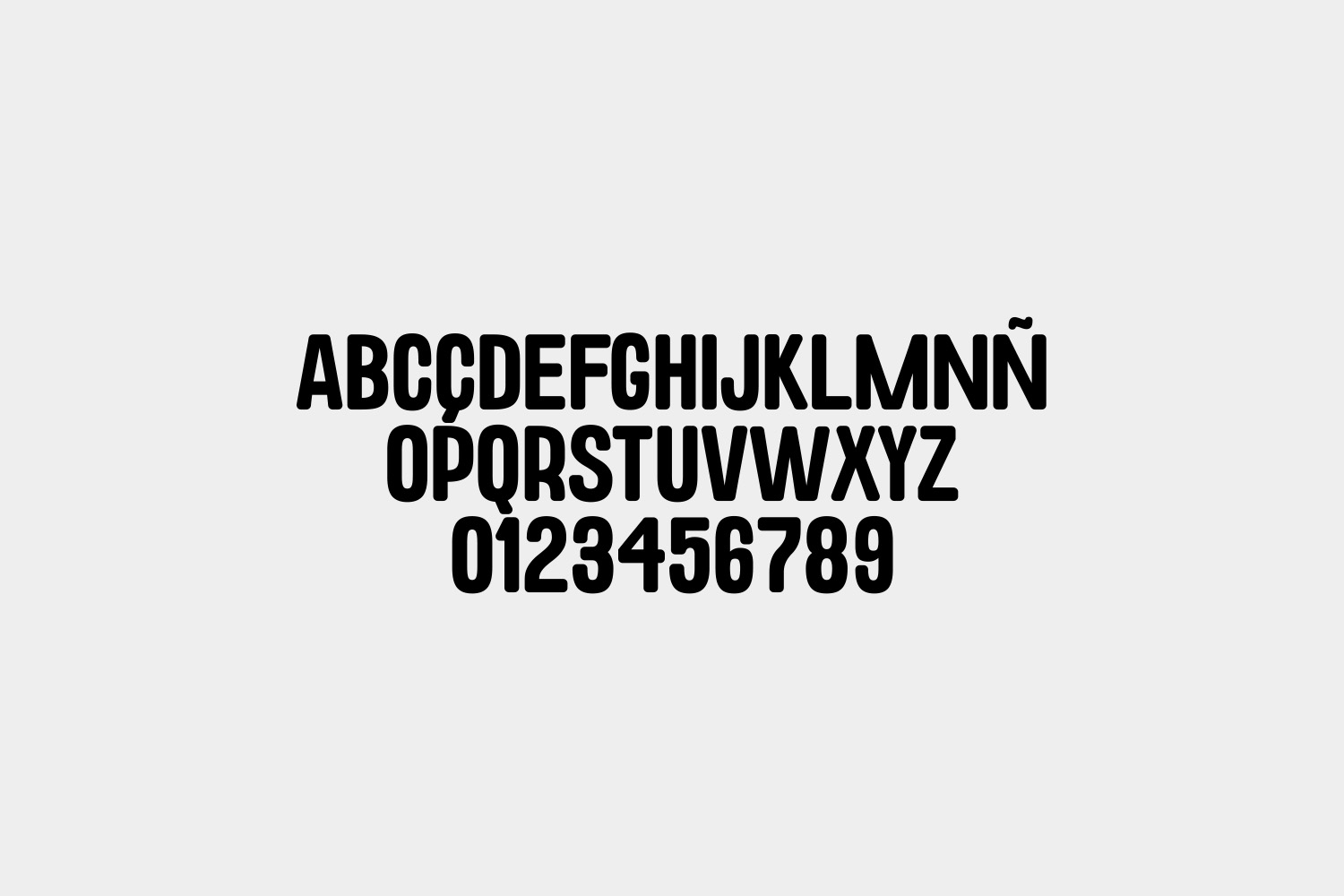
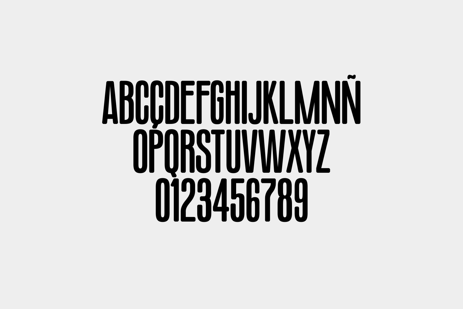
The idea of the classic nuclear family as the only possible family model has become obsolete. The families that visit CaixaForum are plural and diverse. With that in mind we developed a custom typography that would work as the identity for CaixaForum´s family activities. A typographic family with 4 different combinable heights to represent that diversity and a chromatic palette of 7 colors.
The idea of the classic nuclear family as the only possible family model has become obsolete. The families that visit CaixaForum are plural and diverse. With that in mind we developed a custom typography that would work as the identity for CaixaForum´s family activities. A typographic family with 4 different combinable heights to represent that diversity and a chromatic palette of 7 colors.
ES
La idea de un núcleo familiar clásico como el único modelo posible de familia se ha vuelto obsoleto. Las familias que visitan CaixaForum son diversas y plurales. Con esto en mente desarrollamos una tipografía personalizada que funcionara como identidad para las actividades familiares de CaixaForum. Una familia tipográfica de 4 alturas distintas combinables para representar esa diversidad y una paleta cromática de siete colores.
La idea de un núcleo familiar clásico como el único modelo posible de familia se ha vuelto obsoleto. Las familias que visitan CaixaForum son diversas y plurales. Con esto en mente desarrollamos una tipografía personalizada que funcionara como identidad para las actividades familiares de CaixaForum. Una familia tipográfica de 4 alturas distintas combinables para representar esa diversidad y una paleta cromática de siete colores.
TYPEFACE
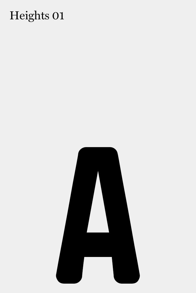
Heights 01
Heights 01
Heights 03
Heights 02

Heights 04

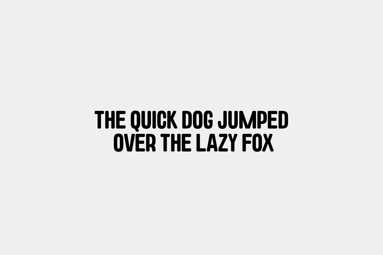
With rounded edges, a condensed width and a bold look, we aimed to create a display family that would represent the CaixaForum Familia identity across every communication piece, creating a graphic system that would be recognisable without the need of a static logotype.
With rounded edges, a condensed width and a bold look, we aimed to create a display family that would represent the CaixaForum Familia identity across every communication piece, creating a graphic system that would be recognisable without the need of a static logotype.


IN USE
Applications

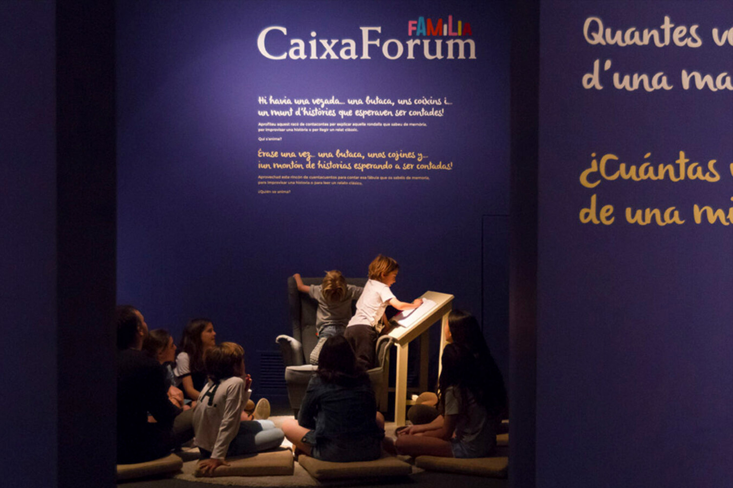
Samples


The design of a typeface at the service of communicating a concept and an identity was the key to the project's success; being able to express the identity in a wide number of centers and range of applications without the need of reproducing a static logotype in all of them, creating an alphabet, a complex system that's also, at the same time, easily readable and recongnisable.
The design of a typeface at the service of communicating a concept and an identity was the key to the project's success; being able to express the identity in a wide number of centers and range of applications without the need of reproducing a static logotype in all of them, creating an alphabet, a complex system that's also, at the same time, easily readable and recongnisable.
Client: CaixaForum | Agency: Soon in Tokyo
Client: CaixaForum
Agency: Soon in Tokyo
Get in touch
Creative Services
©Marc GS 2023
©Marc GS 2021
©Marc GS 2021